| This post was kindly contributed by The SAS Dummy - go there to comment and to read the full post. |
It turns out that I’m not receiving the maximum potential value from my Netflix streaming service. Perhaps it’s because I place too much value on sleep.
With my monthly subscription, I am permitted to view Netflix content 24 hours a day, 7 days a week. In my house I have 6(!) devices that are capable of streaming Netflix content (two computers, a Wii gaming system, an Android phone, an iPod Touch, and an iPad 2). In theory (if given enough bandwidth), I might be able to stream content to all of those devices at the same time. But we typically stream to just one device (usually the Wii, which is connected to our television). And even when we are at our couch-potato-best, we can manage only a 3% utilization of our available Netflix minutes (assuming we stick to serial, not parallel, viewing behavior).
Even so, we are happy with the value of the service. Since Netflix streaming was introduced in September 2007, we have streamed 10,189 minutes of movies and shows into our home. That’s nearly 170 hours, or approximately the equivalent of a complete week. Over 9,000 of those minutes occurred after Netflix introduced streaming support for the Wii gaming console around April 2010. Clearly, we’re not a family who enjoys huddling around the computer screen for movie night. As Audrey noted in the JMP blog, the Wii support was a game changer. You can see the effect from this plot of “Minutes streamed per day” (created using the SERIES statement in SGPLOT):

Recently I used SAS to analyze our use of the Netflix DVD service, and counted the number of titles we received and the rate at which we watched them. But “number of titles” isn’t a reliable metric for the streaming service. The 10,189 minutes of streaming content that we watched covers 270 titles, but some of the titles were very short. For example, my youngest daughter enjoys watching 20-minute episodes of the Garfield cartoon (you can actually watch her brain shrivel while that’s on). Sometimes the kids watch the classic Pink Panther cartoons (completely worthwhile, in my opinion), which are only about 6 minutes each.
You can see how the titles rack up in this chart of “Titles watched per month” (created with the VBAR statement in SGPLOT). (Those very high months reflect my daughter’s unfettered access to Garfield, I’m afraid.)

Just as I did for my previous Netflix DVD analysis, I wanted to devise a metric for measuring our use of the streaming service. I settled on one that measures utilization for each month:
% Utilization = MinutesStreamed / NumberOfAvailableMinutes
Yes, that’s a bit ridiculous, because if we approach 100% utilization it would indicate a serious dysfunction in our family.
The number of minutes in a month will vary according to the number of days, but a simple DATA step can figure that out for me:
/* SAS program to calculate minutes in a month */
data months (keep=date daysInMonth minutesInMonth);
  length date 8;
  format date monyy7.;
  do yr = 2007 to 2011;
    do mon = 1 to 12;
      date = mdy(mon, 1, yr);
      eom=intnx('month',date,0,'end');
      daysInMonth=day(eom);
      minutesInMonth = 24*60*daysInMonth;
      output;
    end;
  end;
run;
Matching this up with the number of minutes actually viewed and applying my fancy formula, I can use SGPLOT to create a utilization chart. I added a LOESS smoothing curve so you can better see the trend.

Notice that I allowed the y axis to scale naturally to its high value of 3%. If I forced the scale with yaxis max=1, the result would be a bit depressing, as I might get the impression that I was wasting my monthly fee.
How I did it
As with my previous Netflix project, I performed all of my work in SAS Enterprise Guide. Here is the process flow I wound up with (click the image for the full-size version):

I imported my Netflix account data into SAS by first pulling it into Excel, using the Get External Data->from Web feature as before. This time though, the URL to read pertains to my streaming data:
https://account.netflix.com/WiViewingActivity?&all=true
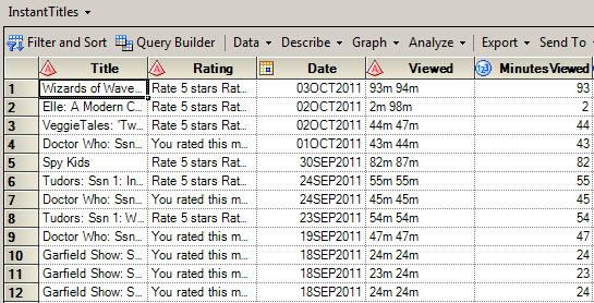
I found that the data as read from this page was not quite as “neat” as with the DVD data. That doesn’t surprise me, because not only is the nature of the data a bit different, but the data “producers” are probably different people. While I’m impressed with the consistency of information as displayed in the Netflix web site, data silos can exist in any company, and Netflix has said that its DVD business was already separate from its streaming business. After import and a bit of cleansing, here is what the streaming data looks like:
The remainder of the project consists of some query steps for summarizing (PROC SQL), one-way frequency steps (PROC FREQ) for counting minutes watched in a month, and some custom SAS programs for other data prep and plots.
Overkill? Naw…
Yes, this is an example of my use of the Big Bazooka of SAS on a pop-gun data and analytical problem. But it’s in the realm of problems that I can understand (somewhat limited), and I hope that you can see how to apply some of these capabilities and thinking to the problems that you encounter out there in the real world. And who knows? Perhaps someday I won’t need to even leave the Wii to perform this analysis.
| This post was kindly contributed by The SAS Dummy - go there to comment and to read the full post. |