| This post was kindly contributed by SAS Users - go there to comment and to read the full post. |
Data visualization has never been more widespread and consumed by a global audience as it has been this year with the Coronavirus pandemic. If you are interested in the statistics behind many of the numbers you see displayed in data visualizations then please reference my colleague’s blog series:
- Sensitivity and Specificity in Disease Testing: Part 1 of Statistical Concepts in the Time of Coronavirus
- SAS Can Help You Understand the Spread of Infectious Diseases: Part 2 of Biostatistical Concepts in the Time of Coronavirus
- Network Analysis in SAS Visual Analytics: Part 3 of Biostatistics in the Time of Coronavirus
One visualization that is commonly used to display metrics of Coronavirus is a bar line chart where the bars display the actual values and the line is a moving average metric.
The screenshot below shows the number of web visits per week and a 5 week moving average value. I’ve named it Visits (5 Week Moving Avg Bracket) since I am including both past and present data points into this calculation.
I will demonstrate how to easily generate this moving average metric to use in your SAS Visual Analytics reports.

Moving Average
Moving average is essentially a block of data points averaged together, creating a series of averages for the data. This is commonly used with time series data to smooth out short-term fluctuations and highlight longer-term trends or cycles.
Traditionally, the moving average block takes the current data point and then moves forward in the series, which is often the case in financial applications. However, it is more common in science and engineering to take equal data points before and after the current position, creating what I am calling a moving average bracket.
SAS’ Visual Analytics calculation gives you the flexibility to define how to average the data points for your moving average: how many positions prior and/or after the current data point.
Steps to generate the Moving Average
From the Data pane, right-click on the measure you want to generate the moving average and select New calculation.

Next, in the Create Calculation window:
- Name: Visits (5 Week Moving Avg Bracket) (a meaningful name of your choice)
- Type: Moving average
- Number of cells to average: 5 (or the number of your choice)
Click OK.

Notice that you did not have the option to specify how many data points to include before and after the current position. To do that, we will right-click on the generated calculation and select Edit.

From the Edit Calculated Item window, make your starting and ending point position selections. The current position is denoted as zero. In my example, I want a 5 point moving average bracket, therefore I want to average the two positions before current, (-2), current, and then the two positions after current (2).

Success. We now have generated our 5 point moving average bracket. You may be wondering, where do you specify the time frame? Granted I named this metric Visits (5 Week Moving Average Bracket) but I did not specify the week time metric anywhere. This is because, for this aggregated measure, the time duration is directly dependent on the data items you have assigned to the object.
In my example, for my web visit data, I want to look at the aggregation at the week level, therefore this Aggregate Cell measure will be grouped by week. I wanted to name my measure appropriately so that any user reading the visual knows the time frame that is being averaged.
If you are unsure of how you want to aggregate your time series, or you are allowing your report viewers the ability to change the role assignments through self-service reporting (see blog or YouTube for more information) then it would be best if you name your measure as 5 Point Moving Average Bracket and leave off the aggregation of the time series.

Let’s take a look at what the numbers are behind the scene. I’ve expanded the object to its Maximize mode so that I can see the summary table of the metrics that make up this object.
The data points will average until the full bracket size is met, then it will slide that bracket down the time series. Keep in mind that our bracket size is five points, two previous data points (-2), current data point (0), and two future data points (2).
Let’s look at week 01. Week 01 is our current, or zero, position. We do not have any prior data points so the only points that can be used from the bracket are positions 1 and 2. See the first highlighted yellow Visits (5 Week Moving Avg Bracket) and how it corresponds to the Visits.
Next, week 02 is able to include a -1 position into the bracket. The full moving average bracket isn’t met till week 03 where all of the data points: -2 through 2 are available. Then the moving average bracket slides along the rest of the time series.

Seeing the object’s summary data and the breakdown of how the moving average bracket is calculated for the data should drive home the fact that the time period aggregation is solely driven by the object’s role assignments.
In my second example, I am looking at retail data and this is aggregated to the day level.
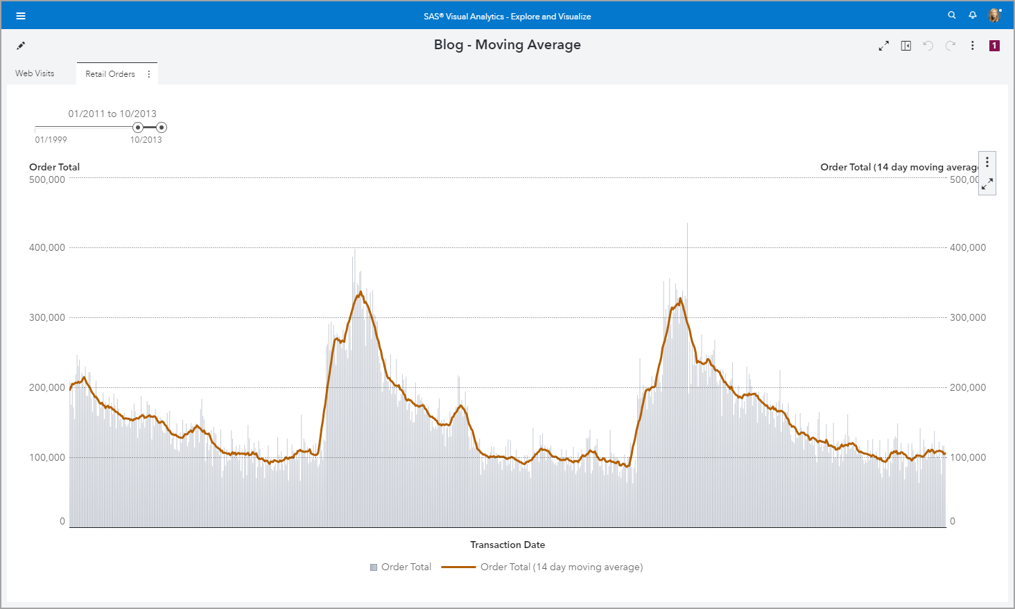
I chose to demonstrate a 14 day moving average bracket.

Bar Line Chart
In both of my examples, I used the Dual axis bar-line chart object. Default Y axis behavior for bar charts is to start at zero, but line charts since they are intended to show trend can start at a value other than zero. Use the Options pane to select your desired line chart baseline. I choose to have both my bar and line charts fixed at zero. Explore the other Options to further customize your visual.

Summary
Calculating the moving average is offered as a SAS Visual Analytics out-of-the-box Derived Item. See the SAS Documentation for more information about Derived Items.
Once you’ve specified the window of data points to average for the moving average you can go back and edit the starting and ending points around the current position. Remember that you will not be specifying a time frame for the aggregation but it will be dynamically determined based on the role assignments to the visual.
Learn more
If you are interested in other uses for the moving average operator Aggregate Cells take a look at this article: VA Report Example: Moving 30 Day Rolling Sum.
Also, check out these resources:
- The Hull moving average: Implement a custom time series smoother in SAS
- Implementing HMA, WMA & SMA with 27 lines of SAS code
- How to Calculate Hull Moving Average in SAS Visual Analytics
SAS Visual Analytics example: moving average was published on SAS Users.
| This post was kindly contributed by SAS Users - go there to comment and to read the full post. |