| This post was kindly contributed by The SAS Dummy - go there to comment and to read the full post. |
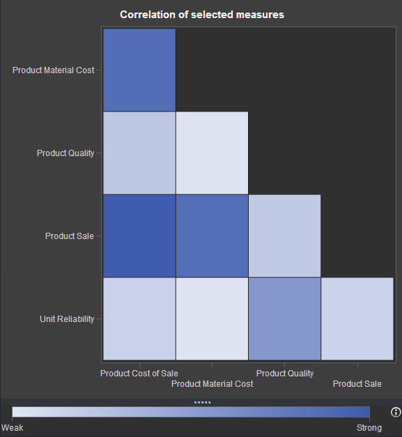 If you’ve watched any of the demos for SAS Visual Analytics (or even tried it yourself!), you have probably seen this nifty exploration of multiple measures.
It’s a way to look at how multiple measures are correlated with one another, using a diagonal heat map chart. The “stronger” the color you see in the matrix, the stronger the correlation.
You might have wondered (as I did): can I build a chart like this in Base SAS? The answer is Yes (of course). It won’t match the speed and interactivity of SAS Visual Analytics, but you might still find this to be a useful way to explore your data.
The approach
There are four steps to achieving a similar visualization in the 9.3 version of Base SAS. (Remember that ODS Graphics procedures are part of Base SAS in SAS 9.3, so you don’t need SAS/GRAPH for this example!)
- Use the CORR procedure to create a data set with a correlations matrix. Actually, several SAS procedures can create TYPE=CORR data sets, but I used PROC CORR with Pearson’s correlation in my example.
- Use DATA step to rearrange the CORR data set to prepare it for rendering in a heat map.
- Define the graph “shell” using the Graph Template Language (GTL) and the HEATMAPPARM statement. You’ve got a lot of control over the graph appearance when you use GTL.
- Use the SGRENDER procedure to create the graph by applying the CORR data you prepared in the first two steps.
Here’s an example of the result:

The program
I wrapped up the first two steps in a SAS macro. The macro first runs PROC CORR to create the matrix data, then uses DATA step to transform the result for the heat map.
Note: By default, the PROC CORR step will treat all of the numeric variables as measures to correlate. That’s not always what you want, especially if your data contains categorical columns that just happen to be numbers. You can use DROP= or KEEP= data set options when using the macro to narrow the set of variables that are analyzed. The examples (near the end of this post) show how that’s done.
/* Prepare the correlations coeff matrix: Pearson's r method */
%macro prepCorrData(in=,out=);
  /* Run corr matrix for input data, all numeric vars */
  proc corr data=&in. noprint
    pearson
    outp=work._tmpCorr
    vardef=df
  ;
  run;

  /* prep data for heat map */
data &out.;
  keep x y r;
  set work._tmpCorr(where=(_TYPE_="CORR"));
  array v{*} _numeric_;
  x = _NAME_;
  do i = dim(v) to 1 by -1;
    y = vname(v(i));
    r = v(i);
    /* creates a lower triangular matrix */
    if (i<_n_) then
      r=.;
    output;
  end;
run;

proc datasets lib=work nolist nowarn;
  delete _tmpcorr;
quit;
%mend;
You have to define the graph “shell” (or template) only once in your program. The template definition can then be reused in as many PROC SGRENDER steps as you want.
This heat map definition uses the fact that correlations are always between -1 and 1. Negative numbers show a negative correlation (ex: cars of higher weight will achieve a lower MPG). It’s useful to select a range of colors that make it easier to discern the relationships. In my example, I went for “strong” contrasting colors on the ends with a muted color in the middle.
  /* Create a heat map implementation of a correlation matrix */
ods path work.mystore(update) sashelp.tmplmst(read);

proc template;
  define statgraph corrHeatmap;
   dynamic _Title;
    begingraph;
      entrytitle _Title;
      rangeattrmap name='map';
      /* select a series of colors that represent a "diverging"  */
      /* range of values: stronger on the ends, weaker in middle */
      /* Get ideas from http://colorbrewer.org                   */
      range -1 - 1 / rangecolormodel=(cxD8B365 cxF5F5F5 cx5AB4AC);
      endrangeattrmap;
      rangeattrvar var=r attrvar=r attrmap='map';
      layout overlay /
        xaxisopts=(display=(line ticks tickvalues))
        yaxisopts=(display=(line ticks tickvalues));
        heatmapparm x = x y = y colorresponse = r /
          xbinaxis=false ybinaxis=false
          name = "heatmap" display=all;
        continuouslegend "heatmap" /
          orient = vertical location = outside title="Pearson Correlation";
      endlayout;
    endgraph;
  end;
run;
You can then use the macro and template together to produce each visualization. Here are some examples:
/* Build the graphs */
ods graphics /height=600 width=800 imagemap;

%prepCorrData(in=sashelp.cars,out=cars_r);
proc sgrender data=cars_r template=corrHeatmap;
   dynamic _title="Corr matrix for SASHELP.cars";
run;

%prepCorrData(in=sashelp.iris,out=iris_r);
proc sgrender data=iris_r template=corrHeatmap;
   dynamic _title= "Corr matrix for SASHELP.iris";
run;

/* example of dropping categorical numerics */
%prepCorrData(
  in=sashelp.pricedata(drop=region date product line),
  out=pricedata_r);
proc sgrender data=pricedata_r template=corrHeatmap;
  dynamic _title="Corr matrix for SASHELP.pricedata";
run;
Download complete program: corrmatrix_gtl.sas for SAS 9.3
Spoiler alert: These steps will only get easier in a future version of SAS 9.4, where similar built-in visualizations are planned for PROC CORR and elsewhere.
Related resources
You can apply a similar “heat-map-style” coloring to ODS tables by creating custom table templates.
If you haven’t yet tried SAS Visual Analytics, it’s worth a test-drive. Many of the visualizations are inspiring (as this blog post proves).
Finally, while I didn’t dissect the GTL heat map definition in detail in this post, you can learn a lot more about GTL from Sanjay Matange and his team at the Graphically Speaking blog.
Acknowledgments
Big thanks to Rick Wicklin, who helped me quite a bit with this example. Rick validated my initial approach, and also provided valuable suggestions to improve the heat map and the statistical meaning of the example. He pointed me to http://colorbrewer.org, which provides examples of useful color ranges that you can apply in maps — colors that are easy to read and don’t distract from the meaning.
Rick told me that he is working on some related work coming up on his blog and within SAS 9.4, so you should watch his blog for additional insights.
| This post was kindly contributed by The SAS Dummy - go there to comment and to read the full post. |