This article shows you how to enter data so that you can easily open in statistics packages such as R, SAS, SPSS, or jamovi (code or GUI steps below). Excel has some statistical analysis capabilities, but they often provide incorrect answers. For … Continue reading →
Tag: data science
Gartner’s 2018 Take on Data Science Tools
I’ve just updated The Popularity of Data Science Software to reflect my take on Gartner’s 2018 report, Magic Quadrant for Data Science and Machine Learning Platforms. To save you the trouble of digging though all 40+ pages of my report, … Continue reading →
jamovi for R: Easy but Controversial
jamovi is software that aims to simplify two aspects of using R. It offers a point-and-click graphical user interface (GUI). It also provides functions that combines the capabilities of many others, bringing a more SPSS- or SAS-like method of programming … Continue reading →
ggformula: another option for teaching graphics in R to beginners
A previous entry (http://sas-and-r.blogspot.com/2017/07/options-for-teaching-r-to-beginners.html) describes an approach to teaching graphics in R that also “get[s] students doing powerful things quickly”, as David Robinson suggested.
In this guest blog entry, Randall Pruim offers an alternative way based on a different formula interface. Here’s Randall:
For a number of years I and several of my colleagues have been teaching R to beginners using an approach that includes a combination of
- the
latticepackage for graphics, - several functions from the
statspackage for modeling (e.g.,lm(), t.test()), and - the
mosaicpackage for numerical summaries and for smoothing over edge cases and inconsistencies in the other two components.
Important in this approach is the syntactic similarity that the following “formula template” brings to all of these operations.
goal ( y ~ x , data = mydata, … )
Many data analysis operations can be executed by filling in four pieces of information (goal, y, x, and mydata) with the appropriate information for the desired task. This allows students to become fluent quickly with a powerful, coherent toolkit for data analysis.
Trouble in paradise
As the earlier post noted, the use of
Trouble in paradise
As the earlier post noted, the use of
lattice has some drawbacks. While basic graphs like histograms, boxplots, scatterplots, and quantile-quantile plots are simple to make with lattice, it is challenging to combine these simple plots into more complex plots or to plot data from multiple data sources. Splitting data into subgroups and either overlaying with multiple colors or separating into sub-plots (facets) is easy, but the labeling of such plots is not as convenient (and takes more space) than the equivalent plots made with ggplot2. And in our experience, students generally find the look of ggplot2 graphics more appealing.
On the other hand, introducing
ggplot2 into a first course is challenging. The syntax tends to be more verbose, so it takes up more of the limited space on projected images and course handouts. More importantly, the syntax is entirely unrelated to the syntax used for other aspects of the course. For those adopting a “Less Volume, More Creativity” approach, ggplot2 is tough to justify.ggformula: The third-and-a half way
Danny Kaplan and I recently introduced
ggformula, an R package that provides a formula interface to ggplot2 graphics. Our hope is that this provides the best aspects of lattice (the formula interface and lighter syntax) and ggplot2 (modularity, layering, and better visual aesthetics).For simple plots, the only thing that changes is the name of the plotting function. Each of these functions begins with
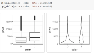
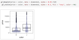
gf. Here are two examples, either of which could replace the side-by-side boxplots made with lattice in the previous post.
We can even overlay these two types of plots to see how they compare. To do so, we simply place what I call the “then” operator (
%>%, also commonly called a pipe) between the two layers and adjust the transparency so we can see both where they overlap.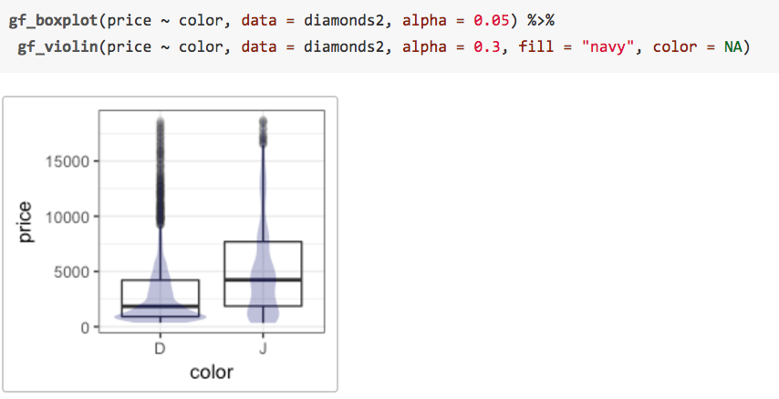
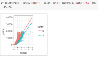
Comparing groups
Groups can be compared either by overlaying multiple groups distinguishable by some attribute (e.g., color)

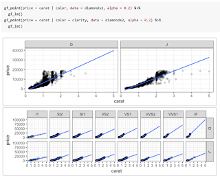
or by creating multiple plots arranged in a grid rather than overlaying subgroups in the same space. The
ggformula package provides two ways to create these facets. The first uses | very much like lattice does. Notice that the gf_lm() layer inherits information from the the gf_points() layer in these plots, saving some typing when the information is the same in multiple layers.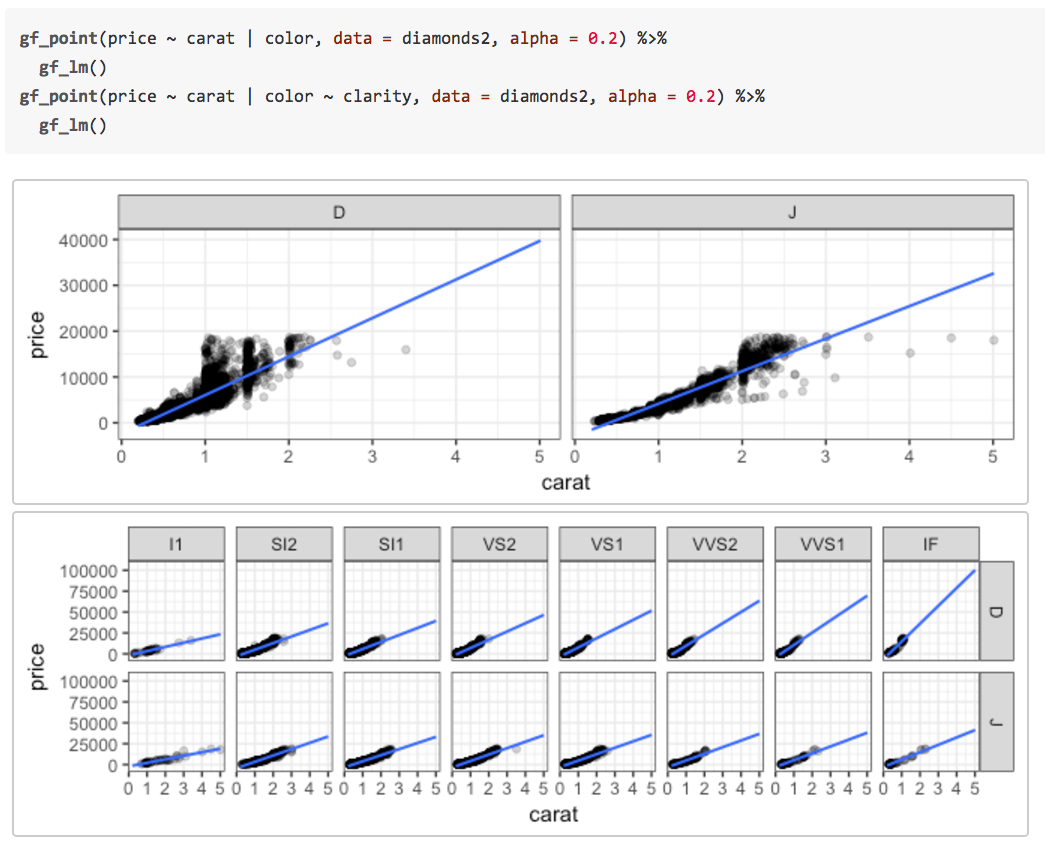
The second way adds facets with
gf_facet_wrap() or gf_facet_grid() and can be more convenient for complex plots or when customization of facets is desired.Fitting into the tidyverse work flow
ggformala also fits into a tidyverse-style workflow (arguably better than ggplot2 itself does). Data can be piped into the initial call to a ggformula function and there is no need to switch between %>% and + when moving from data transformations to plot operations.
Summary
The “Less Volume, More Creativity” approach is based on a common formula template that has served well for several years, but the arrival of
ggformula strengthens this approach by bringing a richer graphical system into reach for beginners without introducing new syntactical structures. The full range of ggplot2 features and customizations remains available, and the ggformula package vignettes and tutorials describe these in more detail.— Randall Pruim
Data Science Tool Market Share Leading Indicator: Scholarly Articles
Below is the latest update to The Popularity of Data Science Software. It contains an analysis of the tools used in the most recent complete year of scholarly articles. The section is also integrated into the main paper itself. New … Continue reading →
Dueling Data Science Surveys: KDnuggets & Rexer Go Live
What tools do we use most for data science, machine learning, or analytics? Python, R, SAS, KNIME, RapidMiner,…? How do we use them? We are about to find out as the two most popular surveys on data science tools have … Continue reading →
Forrester’s 2017 Take on Tools for Data Science
In my ongoing quest to track The Popularity of Data Science Software, I’ve updated the discussion of the annual report from Forrester, which I repeat here to save you from having to read through the entire document. If your organization … Continue reading →
Jobs for “Data Science” Up 7-fold, for “Statistician” Down by Half
The Bureau of Labor Statistics projects that jobs for statisticians will grow by 34% between 2014 and 2024. However, according to the nation’s largest job web site, the number of companies looking for “statisticians” is actually in sharp decline. Those … Continue reading →